Here are several most commonly-seen mistakes in interaction design process:
1. Immediately start to drawing when the product manager put forward a needs.
2. Check competitor products during the design process while there is no specific category.
3. Be obsessed with some design details too much
4. Submit a design scheme without any design process but only results.
Mistakes above may lead to consequences below:
1. Getting lost in problem solving or linger on the surface of the problem forever.
2. Relying too much on brainstorming without theory guidance.
3.Often being challenged by others but cannot convince them with objective reasons.
4. Having trouble with assess the value and effect of the design
Designers can follow the process below to comb the needs and put forward well-founded and scientific design scheme.
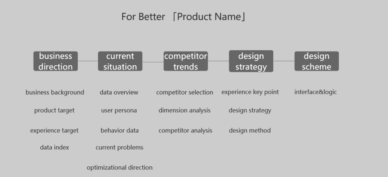
Step1: business direction.
In business direction, the most important thing is to understanding the needs and specify design standard. Only when we figure out product, experience and data index can we obtain a criterion before making further design steps. Even in further interaction design process, designers need to recheck the goal while encountering divergences. What benefits the gold worth sticking to, all the rest should be left out. Designers need to pay attention to the data index and must ask product managers for a certain index. The certain index can be business index like turnover and user quantity or user behavior index like click rate and staying rate, besides, it also includes user’s feedback index like favorable rate and recommendation value. Whatsoever, you must get a data index, otherwise all the design afterwards will be unreasonable and all the disputes will make no sense. Remember, no one likes to do something that cannot be decided by value.
Step2: Combing the current situation.
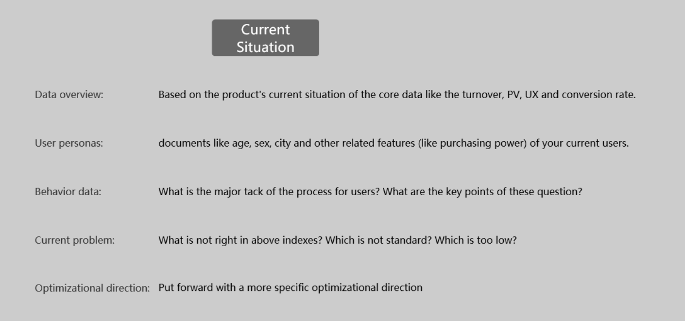
In step2, you need to collect the current related product data including what is mentioned in step1. Yet if allowed to, you can compare the data with other similar or same product dara.
For example, once you get the competing product data, you can directly do the comparison to see the difference in the core data; if there is no competing product, you can also do the comparison between different user story and scenarios in your own product; if you got nothing, you are still able to compare with previous data.
In the part of user persona, all you need to do is to compare “target user personas” with “real user personas”. You need to make it clear whether the data discrepancy comes from the product design or the user features.
When you have done the data analysis, the current problem of the product will emerge automatically: which index is under the expectation? Which index can be increased in the future? All of these will be the key points of further optimization.
Step3 Competing product analysis
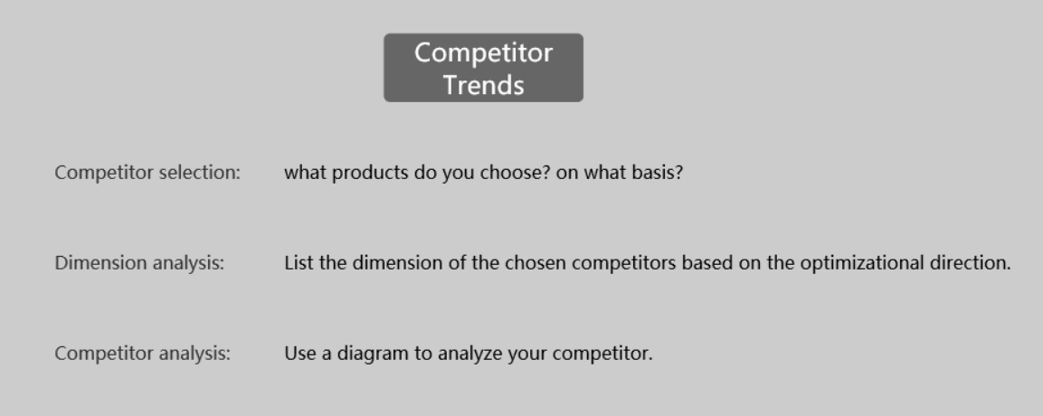
To avoid the haste in interacction design process, we need to comb and analyze the competing products in advance. I will firstly point out what most people do - making competing product analysis a game of “spotting the differences”.
In other words, most people love to put the screenshots of one competing product to see what is different. They indeed submit a competing product analysis report, which, is in fact all about facts and you can not even read a word of analysis.
Even the products of the same category differ a lot. As a result, we can not simply look for difference on the interface. I highly recommended designers to get out of the design background to have a fresh look at the competing products. This will truly help you to become professional and subjective.
Therefore, the final analysis result should be in a “subject+image”analysis form. For example:
In the configuration relation ship of image, title and description, how many Apps put the text on the left side and images on the right? How many Apps are in the up-down structure? How many Apps are in the nested structure?
In the evaluation system, how many Apps adopt 3 ways? How many adopt 4? 5?
Theoretically, the number of these interaction solutions are exhaustible, so you can infer the trends of the current environment.(unless you want to make a bizarre and unique product.) By the way, as a designer you should be open to external resources in case that you unconsciously get trapped in a vicious circle.
Step4 Have a comprehensive design strategy
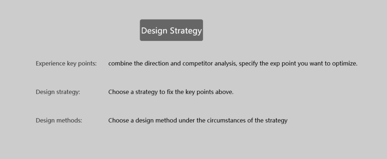
Describing the goal in detail is a very effective design key point that is east to be neglected. We have to remind ourselves over and over gain what we are doing instead of being caught in endless details.
The key point of experience can be in this form: letting users learn to use the product easily; letting users have more customized choices; letting users use the product with higher efficiency.
The design strategy can be in this form: lowering the threshold of the product; deepening the information hierarchy; using new design languages.
The design method can be in this form: providing guidance; classifying infographics and showing the right information on the right time; using the interaction visual design that is corresponding with the whole App style.
The design method can be in this form: providing guidance; classifying infographics and showing the right information on the right time; using the interaction visual design that is corresponding with the whole App style.
Perhaps some designers take this literal descriptions as redundant, but it is actually very important and should not be skipped. When you finish the intellectual work you will find it’s very easy to do the rest according to the strategy and method and it is far more efficient.
Step5 Make the design scheme
At last, you will just realize the design scheme is already formed in the interaction design process.
More Articles:
评论
发表评论