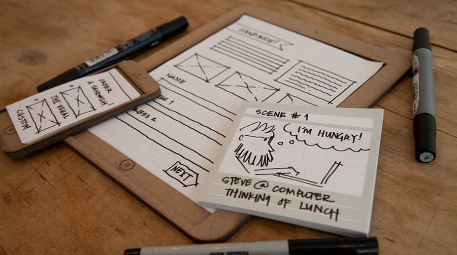
Prototyping is an effective approach to turn your ideas into a crowd-funding product, but it’s not easy to pick the best prototyping tools for your style, especially with all sorts of tools available on the current market. From my point of view, the foremost concern while choosing a prototyping tool is whether it fits perfectly into the design goals. In the following, I’ve made a list of prototyping tools recommended for 4 different design scenarios, with both free and premium tools included.
Scenario 1 – Medium-to-Low Fidelity & Quick Mobile/Web App
Generally, the medium-to-low fidelity refers to those prototypes with limited functionalities and interactions, applying to showcase the design ideas, scenarios and interface layouts as well. It helps a lot in the communication, presentation and report process. As far as I am concerned, the best tool for this scenario can showcase the entire flow of the app experience in a short period of time. Here I recommend two prototyping tools for mobile apps:

Main characteristics:
1. Building for mobile apps
2. Medium-to-low fidelity
3. Need to go fast
Recommended tools:
• Mockplus
• Balsamiq
Scenario 2 – Responsive Design
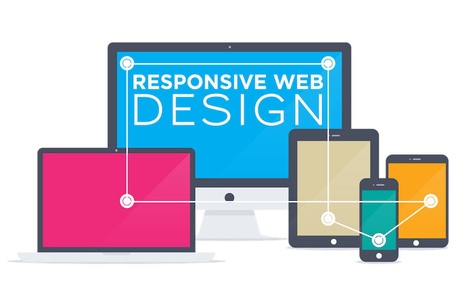
When faced with the responsive design requirements of users, we should firstly figure out those questions: Why the responsive design is needed there? What’s the goal of the responsive design? What are the detailed requirements for each element? Needless to say, the responsive design requires technical support, including the front-end and back-end development, to make the design process as time-efficient as possible.

Main characteristics:
1. Building for responsive web design (on mobile, tablet and desktop).
2. Time-efficient and effective.
3. Need to link the pages together and showcase the flow.
Recommended tools:
• Raw HTML/CSS/JS
• UXPin
Scenario 3 – High-Fidelity Prototype (on Mobile & Desktop)
Not only does this scenario require the high-fidelity prototype, but also need to showcase the whole flow in the application. To be frank, this is a time-consuming task. To build a high-fidelity prototype with interesting animations and navigation between pages, you can take the following tools for reference:

Main characteristics:
1. Building a specific animation on app.
2. Need to build high-fidelity prototype.
3. Need to be time-efficient.
4. Need to show the animation elements.
Recommended tools:
• Flinto
• Origami
Scenario 4 – Some Specific & Functional Features

Main characteristics:
1. Build a specific animation on a mobile app.
2. Need a high-fidelity prototype.
3. Need to be time-efficient.
4. Need to showcase the animation elements.
Recommended tools:
• Adobe After Effects
Sum Up
As is said by Julie Zhuo, the director of design at Facebook, “the Design Thinking will just be the product thinking.” For fellow designers, we need to focus more on our design ideas instead of the tool itself. What’s needed in the communication, presentation as well as testing process? What kind of scenarios that we need to build? How is the fidelity of the prototype? Focus on the design requirements and you will then know which are the best prototyping tools to choose. Also, it’s worthwhile to learn as many mainstream prototyping tools as possible for future use.
Meanwhile, I do believe that a good tool should be both “Fast” and “Easy” to use, for better serving the design thinking and designers themselves. And this is exactly what Mockplus has always advocated since the inception. For those looking for a rapid prototyping tool with a good balance of functionality and affordability, this is an ideal choice!
More Articles:
Nice list of tools, thank you. Also I think that this article is useful too - https://www.cleveroad.com/blog/discover-11-best-prototyping-tools-for-designers-to-use-in-2017
回复删除