In UI design, what scenario should hollow icons and solid icons be applied to? Some believe that the hollow icons are visually more complex than the solid icons, while the solid icons are in fact more recognizable.
The opinions of designers on this topic varies. Some designers think that the hollow icons is made by lines, as a result of which, they are more difficult to recognize. However, they gives users a feeling of ease and exquisiteness. Others deem that the recognizability has nothing to do with this topic, but depends on the shape, color and other factors of the icon.
1. The function of icons.
First, this topic focuses on a specific type of icons: functional icon. Let’s take a look at the basic functions of this type of icons.
Functional icons are common in life, usually seen in the airport, stations, hotels, shopping malls and other large public places, providing guidance to people, as shown below:

In UI design, icons are one of the most common elements. The use of the icon originated in the Macintosh 1.0, even in the earlier Xerox graphical interface began. They are often given functions like action, description and so on.

Since the release of the smart phone system so far, the style of graphical interface has completed the transformation from the material design to the flat design evolution. With the introduction of ios7, almost all of the icons in Apps are becoming more and more flat and slim. The reason of it is that the over-eye-catching icons usually reduce the readability of the contents.
In general, the most basic function of the icons is to convey the information quickly.
In today's design work, the matching of icons and texts has reached a point of obsession. In fact, it is enough to express some abstract concepts with text. Putting an icon aside actually helps nothing about making users build connections between the icon and its function.

Nevertheless, icons are still relatively important. The function of icons is far more than“telling users the meaning on the first signt”. In addition, there are also many important features like immediate locating, content layer distinguishing and interface rhythm increasing.
Take a prototype example on Mockplus for example, if you just see the icons without the texts, the meaning of them is quite obscure. However, the functions of icons are more than that. The icons in the prototype is solid. The icons and the text together form a unity, in which the icons plays a role of alignment. If you remove the icons, the information in the list will be indistinguishable and there will be a visual confusion. Users will face more difficulty when focusing on the options on a line.
2. Are solid icons more recognizable?
Given that you were summoned by the call of nature and rushed into the big mall to find the rest room. Solid icons or hollow icons? Which can be recognized more quickly?

Solid icons are indeed more recognizable in the perspective of visual attraction. The following picture shows the influence of the elements that are attractive to the human eye (sorted from left to right):
Hollow icons attract the eye by their shapes while the solid ones do the same by their color. As a result, hollow icons are more difficult to recognize.
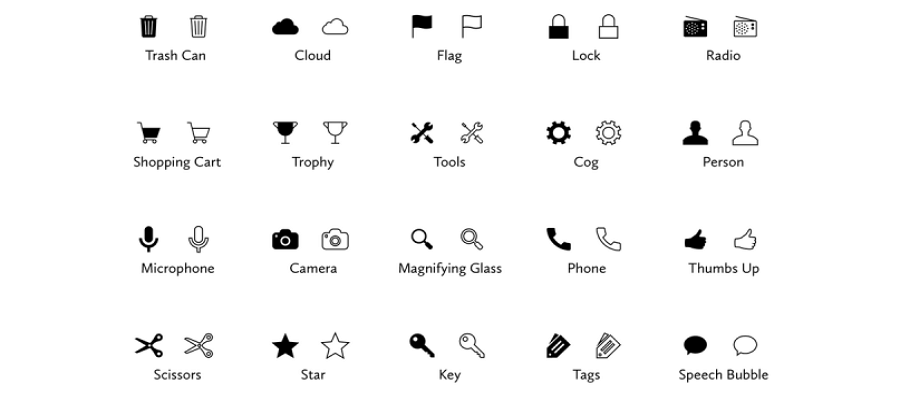
As early as the iOS7 system was introduced, there have been some discussion about this topic. Curt Arledge, an experienced designer who graduated from Viget, wrote an APP specifically, and did 1260 recognition tests for solid and hollow icons [1], look at the test results:

The results found that the difference of the speed of recognizing these \two types of icons is just 0.1 seconds.

In the first group, the solid icons won. These icons are derived from life, the icons kept their original meanings. The recognition speed depends on how much the color and shape attract the eyes. So the solid icons are easier to recognize.

It is worth noting that the three hollow icons are more recognizable in the second group.
These three icons are abstracted from subjects in real life, among which the speech bubble does not exists at all. Designers create this icon in the graphical interface and endow it with a meaning; The forms of garbage bin and keys are various in life, so the icons of them are abstract summaries of them. In this case, the shape of the icons allows users to quickly identify the meaning of the icons, while the colors has become a factor of interference.
So, for icons expressing the same meaning of the original subjects, solid icons are more recognizable. For icons that endowed with abstract meanings, hollow icons are better.
Author: cyRote
Translator: Devin
Original site:uisdc
Orignal link: http://www.uisdc.com/hollow-and-solid-icon
More Articles:
评论
发表评论